Calqlatr
一个针对横屏和竖屏设备设计的 Qt Quick 应用程序,它使用自定义组件、响应式布局和 JavaScript 以实现应用程序逻辑。
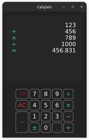
Calqlatr 展示了各种 QML 和 Qt Quick 功能,例如显示自定义组件和使用响应式布局。应用程序逻辑用 JavaScript 实现,用户界面用 QML 实现。
运行示例
要从 Qt Creator 运行示例,请打开 欢迎 模式并从 示例 中选择示例。有关更多信息,请访问 构建和运行示例。
显示自定义组件
在 Calqlatr 应用程序中,使用自定义类型。这些类型定义在其各自的 .qml 文件中
- BackspaceButton.qml
- CalculatorButton.qml
- Display.qml
- NumberPad.qml
要在 Main.qml 中使用这些自定义类型,请添加一个导入语句以导入包含类型的 content 文件夹
import "content"例如,在 Main.qml 中使用 NumberPad 类型来创建计算器数字键盘。它嵌套在 Item 类型中,这是 Qt Quick 中所有视觉项目的基类型
        NumberPad {
            id: numberPad;
            Layout.margins: root.margin
        }
自定义组件是可以在任何 QML 文件中定义的 QML 类型,它们的属性与在自身的 .qml 文件中定义的组件相同,如 NumberPad.qml。在 NumberPad.qml 中定义了 DigitButton 组件和 OperatorButton 组件。可以在这些组件中添加新属性或修改现有属性。这里覆盖了这两个自定义组件的 onReleased 处理器。
    component DigitButton: CalculatorButton {
        onReleased: {
            root.digitPressed(text)
            updateDimmed()
        }
    }

    component OperatorButton: CalculatorButton {
        onReleased: {
            root.operatorPressed(text)
            updateDimmed()
        }
        textColor: controller.qtGreenColor
        implicitWidth: 48
        dimmable: true
    }
此外,使用 CalculatorButton 类型为 NumberPad 上的不同按钮。在 CalculatorButton.qml 中定义了按钮的基本属性,您可以在 NumberPad.qml 中为每个实例修改这些属性。对于数字和运算符按钮,还添加了一些额外的属性,例如 text、width 和 dimmable 属性。使用 dimmable 在计算器引擎不接受来自该按钮的输入时,从视觉上禁用(变暗)按钮。
                DigitButton {
                    text: "e"
                    dimmable: true
                    implicitWidth: 48
                }
在 content 目录中还有一个名为 BackSpaceButton.qml 的文件,这是一个特殊的 CalculatorButton 用例,我们希望在按钮上渲染图像,而不是使用文本。此按钮与 OperatorButton 相同,但包含一个 icon 而不是 text
    icon.source: getIcon()
    icon.width: 38
    icon.height: 38
    icon.color: getIconColor()
    // include this text property as the calculator engine
    // differentiates buttons through text. The text is never drawn.
    text: "bs"

    property bool dimmable: true
    property bool dimmed: false
    readonly property color backgroundColor: "#222222"
    readonly property color borderColor: "#A9A9A9"
    readonly property color backspaceRedColor: "#DE2C2C"
    readonly property int buttonRadius: 8

    function getBackgroundColor() {
        if (button.dimmable && button.dimmed)
            return backgroundColor
        if (button.pressed)
            return backspaceRedColor
        return backgroundColor
响应式布局
在此示例中,响应式布局为竖屏和横屏模式排列不同的 UI 组件。它还允许您在这两种模式之间切换。您可以在 Main.qml 中注意到这一点,它为竖屏模式定义了一个 ColumnLayout,为横屏模式定义了一个 RowLayout。
        ColumnLayout {
            id: portraitMode
            anchors.fill: parent
            visible: true

            LayoutItemProxy {
                target: display
                Layout.minimumHeight: display.minHeight
            }
            LayoutItemProxy {
                target: numberPad
                Layout.alignment: Qt.AlignHCenter
            }
        }

        RowLayout {
            id: landscapeMode
            anchors.fill: parent
            visible: false

            LayoutItemProxy {
                target: display
            }
            LayoutItemProxy {
                target: numberPad
                Layout.alignment: Qt.AlignVCenter
            }
        }
ColumnLayout 表示应用的纵向布局,而 RowLayout 表示横向布局。 visible 属性决定在某一时刻使用哪个布局。 NumberPad 和 Display 组件的 id 属性用于设置 LayoutItemProxy 类型的 target 属性。这使得两个布局能够使用相同的内容项目。此外,可以将在 LayoutItemProxy 项目内部传递属性到 target 本身。例如,当 NumberPad 被实例化时,两个布局都需要不同 Layout.alignment。
通过在 isPortraitMode 属性的信号处理程序中切换两只布局,设置它们的可见性来实现切换。
        onIsPortraitModeChanged: {
            if (isPortraitMode) {
                portraitMode.visible = true
                landscapeMode.visible = false
            } else {
                portraitMode.visible = false
                landscapeMode.visible = true
            }
        }
这是因为 QML 为所有自声明的属性创建信号处理程序,在这个例子中,是 on 处理程序,其中 isPortraitMode 属性。
在为 NumberPad 本身定义纵向和横向布局时,在 NumberPad.qml 中也使用了一个响应式布局。
        RowLayout {
            spacing: controller.spacing

            GridLayout {
                id: scientificGrid
                columns: 3
                columnSpacing: controller.spacing
                rowSpacing: controller.spacing
                visible: !isPortraitMode

                OperatorButton { text: "x²" }
                OperatorButton { text: "⅟x" }
                OperatorButton { text: "√" }
                OperatorButton { text: "x³" }
                OperatorButton { text: "sin" }
                OperatorButton { text: "|x|" }
                OperatorButton { text: "log" }
                OperatorButton { text: "cos" }
                DigitButton {
                    text: "e"
                    dimmable: true
                    implicitWidth: 48
                }
                OperatorButton { text: "ln" }
                OperatorButton { text: "tan" }
                DigitButton {
                    text: "π"
                    dimmable: true
                    implicitWidth: 48
                }
            }

            GridLayout {
                id: mainGrid
                columns: 5
                columnSpacing: controller.spacing
                rowSpacing: controller.spacing

                BackspaceButton {}
                DigitButton { text: "7" }
                DigitButton { text: "8" }
                DigitButton { text: "9" }
                OperatorButton {
                    text: "÷"
                    implicitWidth: 38
                }

                OperatorButton {
                    text: "AC"
                    textColor: controller.backspaceRedColor
                    accentColor: controller.backspaceRedColor
                }
                DigitButton { text: "4" }
                DigitButton { text: "5" }
                DigitButton { text: "6" }
                OperatorButton {
                    text: "×"
                    implicitWidth: 38
                }

                OperatorButton {
                    text: "="
                    implicitHeight: 81
                    Layout.rowSpan: 2
                }
                DigitButton { text: "1" }
                DigitButton { text: "2" }
                DigitButton { text: "3" }
                OperatorButton {
                    text: "−"
                    implicitWidth: 38
                }

                OperatorButton {
                    text: "±"
                    implicitWidth: 38
                }
                DigitButton { text: "0" }
                DigitButton {
                    text: "."
                    dimmable: true
                }
                OperatorButton {
                    text: "+"
                    implicitWidth: 38
                }
            }
        } // RowLayout
在这种情况下,创建了两个 LayoutItemProxy 项目。它们的 target 属性设置为 scientificGrid,一个包含所有科学按钮的 Grid 类型,以及 mainGrid,另一个包含所有标准按钮的 Grid 类型。
在 CalculatorButton.qml 中,数字键盘按钮的文本颜色也被动画化。
        ...
        color: getBackgroundColor()
        border.color: getBorderColor()
    }

    contentItem: Text {
        text: button.text
        font.pixelSize: button.fontSize
        horizontalAlignment: Text.AlignHCenter
        verticalAlignment: Text.AlignVCenter
        color: getTextColor()
        Behavior on color {
            ColorAnimation {
                duration: 120
                easing.type: Easing.OutElastic
            }
通过在 color 属性上定义一个 Behavior 来动画化颜色变化。当一个按钮被设置为 dimmed = true 时,按钮会显得更暗。当按钮被点击时,它会亮起绿色。为了动态更改 NumberPad 上所有按钮的 dimmed 属性,buttonPressed 信号调用 NumberPad 的 updateDimmed() 函数。
    function updateDimmed(){
        for (let i = 0; i < mainGrid.children.length; i++){
            mainGrid.children[i].dimmed = root.isButtonDisabled(mainGrid.children[i].text)
        }
        for (let j = 0; j < scientificGrid.children.length; j++){
            scientificGrid.children[j].dimmed = root.isButtonDisabled(scientificGrid.children[j].text)
        }
    }
执行计算
calculator.js 文件定义了计算器的引擎。它包含用于存储计算器状态的变量,以及当用户按下数字和运算按钮时调用的函数。要使用引擎,请使用别名 CalcEngine 在 Main.qml 文件中导入 calculator.js。
import "content/calculator.js" as CalcEngine默认情况下,从 QML 导入 JavaScript 文件会为其创建一个新的实例,而它所包含的状态在实例之间是唯一的。使用 .pragma library 允许脚本的所有用户共享状态。
.pragma library
当用户按下数字时,数字文本会出现在显示器上。当用户按下运算符时,会执行相应的计算,并可以使用等号 (=) 运算符显示结果。所有清除 (AC) 运算符重置计算器引擎。
文件列表
另请参阅QML 应用程序。
© 2024 The Qt Company Ltd. 本文档中的贡献是各自所有者的版权。本提供的文档根据 Free Software Foundation 发布的 GNU 自由文献许可证版本 1.3 的条款进行许可。Qt 和相应的标志是芬兰和/或其他国家的 The Qt Company Ltd. 的商标。所有其他商标均为其各自所有者的财产。
